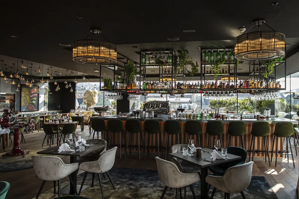
Bottiglie vino Don Leone con nuove etichette restyling — Prosecco Rosé, Oro e Arneis DOC

Introduction

Don Leone is a hospitality group that developed a private-label wine range in collaboration with Borgovecchio. Although the wines themselves were strong, the visual identity did not reflect their quality: the labels lacked consistency and failed to convey the energy and distinctive character of the Don Leone brand.

The project began with this challenge. It was not simply a matter of redesigning the graphics, but of creating a clear, recognisable and scalable visual system. We reworked the label identity to turn each bottle into an effective communications tool aligned with Don Leone’s positioning, improving both the perceived value of the wines and their impact on the shelf.

Client

Don Leone

Category

Website

donleone.ch

Let’s talk about your project

Fill in the form and we’ll get back to you as soon as possible.

Objectives

  • Modernise 22 labels while preserving the bold character of the Don Leone brand
  • Create visual consistency across the entire wine range
  • Differentiate each wine through a distinctive and recognisable colour palette
  • Strengthen the storytelling to make every bottle more memorable
  • Align the design and perceived value with the quality of Borgovecchio’s wines

Challenges

Managing a large number of labels. Redesigning 22 different labels required a structured approach. Creating individual designs was not enough: the project needed a repeatable system that could maintain visual consistency while highlighting the distinctive characteristics of each wine.

Balancing brand personality with clarity. Don Leone has a bold and exuberant identity. The challenge was to translate this personality into the design without compromising clarity and functionality, both of which are essential for a retail product.

Aligning multiple stakeholders around the final result. The project also involved Borgovecchio, requiring close coordination to ensure that the design enhanced the wines while respecting their quality, positioning and individual characteristics.

Creating an effective colour system. We developed a colour palette that makes each wine immediately distinguishable without creating visual confusion. Every choice needed to be aesthetically engaging while also serving a practical purpose.

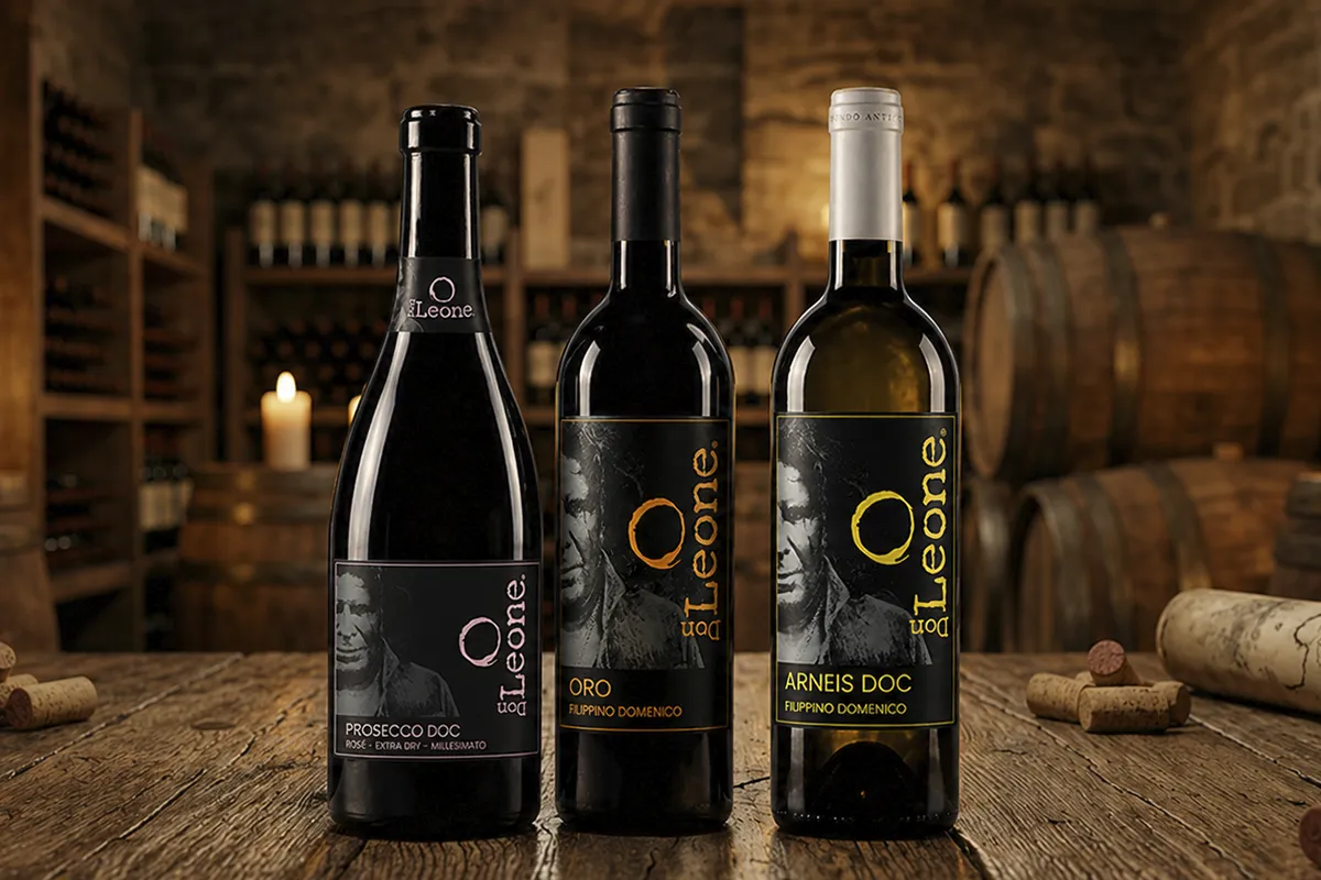
Interno ristorante Don Leone

Results

The project led to a complete redesign of the range, transforming the labels from a secondary element into one of the product’s key strengths.

The new visual identity is consistent, recognisable and easy to apply across every wine in the range. Each bottle retains its own personality through the strategic use of colour while remaining part of a clear and cohesive system.

  • Greater visual consistency across the entire wine range
  • Stronger recognition of the Don Leone brand
  • Immediate differentiation between individual wines
  • Improved perception of the product’s quality

The redesign enabled Don Leone to align the appearance of the range with the quality of the wines, making each bottle more distinctive and consistent with the experience offered by the brand. A graphic design project that became a practical tool for communication and market positioning.